What is Responsive Design and Why Does It Matter?
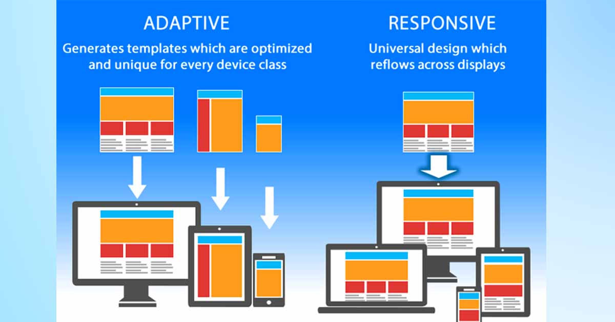
## What is Responsive Design?
Responsive design is a web design approach that automatically adapts your site layout to different screen sizes, such as:
- Smartphones
- Tablets
- Desktops
---
## Why Is It Important?
- Enhances user experience
- Reduces bounce rates
- Complies with Google’s mobile-first indexing
- Eliminates the need for separate mobile apps
---
## How to Get Started?
- Use relative units like `%`, `vw`, and `em`
- Apply **Media Queries** in CSS
- Test layouts on multiple screen sizes
- Use frameworks like Bootstrap or Tailwind CSS
Article Category
What is Responsive Design and Why Does It Matter?
Responsive design ensures your website looks great on all devices. Learn what it is and why it's critical for modern web experiences and SEO. Responsive design is no longer optional—it’s essential for creating professional websites that work across all devices.

Consultation & Communication
Direct communication via WhatsApp or phone to understand your project needs precisely.
Planning & Scheduling
Creating clear work plan with specific timeline for each project phase.
Development & Coding
Building projects with latest technologies ensuring high performance and security.
Testing & Delivery
Comprehensive testing and thorough review before final project delivery.
Related Articles

Best Practices in UI Design

Mobile First Design: Why and How?