Special offer this week
Get 20% off web development packages
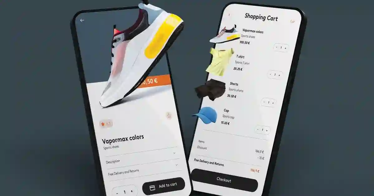
We offer a comprehensive collection of essential educational articles in web development to turn your ideas into digital reality
CSS Grid is the most powerful layout system for controlling rows and columns. Learn to create complex and responsive layouts with high precision.
.grid-definition {
  display: grid;

  /* Column definition */
  grid-template-columns:
    200px /* fixed column */
    1fr /* flexible column */
    minmax(100px, 200px) /* column with min and max */
    auto; /* content-based */

  /* Row definition */
  grid-template-rows:
    60px /* fixed header */
    1fr /* flexible content */
    50px; /* fixed footer */

  /* Definition using line names */
  grid-template-columns:
    [sidebar-start] 250px
    [sidebar-end main-start] 1fr
    [main-end aside-start] 200px
    [aside-end];
}

/* Advanced examples */
.responsive-columns {
  display: grid;

  /* Responsive grid */
  grid-template-columns: repeat(auto-fit, minmax(300px, 1fr));
  gap: 20px;
  padding: 20px;
}

.magazine-layout {
  display: grid;
  grid-template-columns:
    1fr /* main content */
    300px /* sidebar */
    200px; /* ads */
  grid-template-rows:
    80px /* header */
    1fr /* content */
    60px; /* footer */
  gap: 20px;
  min-height: 100vh;
}
.layout-areas {
  display: grid;
  grid-template-areas:
    "header header header"
    "sidebar main aside"
    "footer footer footer";
  grid-template-columns: 200px 1fr 150px;
  grid-template-rows: 80px 1fr 60px;
  gap: 20px;
  min-height: 100vh;
}

/* Assigning elements to areas */
.header {
  grid-area: header;
}
.sidebar {
  grid-area: sidebar;
}
.main {
  grid-area: main;
}
.aside {
  grid-area: aside;
}
.footer {
  grid-area: footer;
}

/* Responsive layout by changing areas */
@media (max-width: 768px) {
  .layout-areas {
    grid-template-areas:
      "header"
      "main"
      "sidebar"
      "aside"
      "footer";
    grid-template-columns: 1fr;
    grid-template-rows: auto auto auto auto auto;
  }
}

/* Complex magazine layout */
.magazine-areas {
  display: grid;
  grid-template-areas:
    "header header header header"
    "hero hero sidebar-1 sidebar-1"
    "article-1 article-2 sidebar-1 sidebar-1"
    "article-3 article-3 sidebar-2 ads"
    "footer footer footer footer";
  grid-template-columns: 1fr 1fr 200px 150px;
  gap: 20px;
}
/* Fully responsive grid */
.responsive-advanced-grid {
  display: grid;
  grid-template-columns: repeat(auto-fit, minmax(300px, 1fr));
  gap: 20px;
  padding: 20px;
}

/* Different layouts for screens */
.adaptive-layout {
  display: grid;
  gap: 20px;

  /* Large screens */
  grid-template-columns: 250px 1fr 200px;
  grid-template-areas:
    "sidebar main aside"
    "sidebar main aside";
}

@media (max-width: 1024px) {
  .adaptive-layout {
    /* Medium screens */
    grid-template-columns: 200px 1fr;
    grid-template-areas:
      "sidebar main"
      "aside aside";
  }
}

@media (max-width: 768px) {
  .adaptive-layout {
    /* Small screens */
    grid-template-columns: 1fr;
    grid-template-areas:
      "main"
      "sidebar"
      "aside";
  }
}

/* Grid with different density */
.density-grid {
  display: grid;
  grid-template-columns: repeat(12, 1fr);
  gap: 15px;
}

.featured-item {
  grid-column: span 6; /* half width */
}

.regular-item {
  grid-column: span 4; /* third width */
}

.small-item {
  grid-column: span 3; /* quarter width */
}

@media (max-width: 768px) {
  .featured-item,
  .regular-item,
  .small-item {
    grid-column: span 12; /* full width on mobile */
  }
}
The HTML and CSS remain structurally the same as the Arabic version, with appropriate text direction and language adjustments for English.
In this lesson we learned:
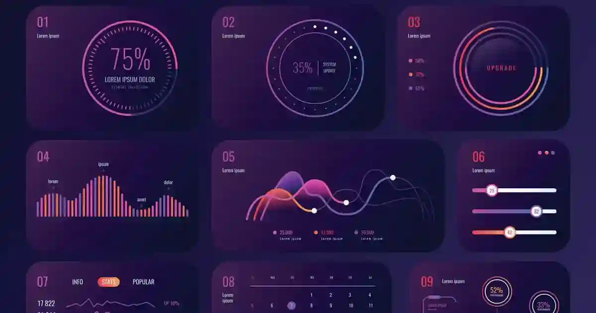
✅ CSS Grid fundamentals ✅ Advanced column and row definition ✅ Item placement and named areas ✅ Grid alignment ✅ Responsive design with Grid ✅ Advanced dashboard project
In the next lesson we'll study Position and Positioning for precise element positioning control.
Master CSS Grid - grid layouts, areas, alignment, and precise control over rows and columns. Practical guide for complex layouts.

Direct communication via WhatsApp or phone to understand your project needs precisely.
Creating clear work plan with specific timeline for each project phase.
Building projects with latest technologies ensuring high performance and security.
Comprehensive testing and thorough review before final project delivery.

If this topic is relevant to your current project, you can jump to one of the services above or browse the services page to choose the most suitable solution.


Get 20% off web development packages
Message now and get an instant quote
Start ranking better with a practical SEO roadmap