Special offer this week
Get 20% off web development packages
We offer a comprehensive collection of essential educational articles in web development to turn your ideas into digital reality
CSS Animations bring life to web interfaces. Learn how to create smooth, engaging motion effects that enhance user experience.
/* Built-in timing functions */
.timing-examples {
  transition-duration: 0.5s;
}

.linear {
  transition-timing-function: linear;
}
.ease {
  transition-timing-function: ease;
}
.ease-in {
  transition-timing-function: ease-in;
}
.ease-out {
  transition-timing-function: ease-out;
}
.ease-in-out {
  transition-timing-function: ease-in-out;
}

/* Custom cubic-bezier curves */
.custom-ease-1 {
  transition-timing-function: cubic-bezier(0.25, 0.46, 0.45, 0.94);
}
.custom-ease-2 {
  transition-timing-function: cubic-bezier(
    0.68,
    -0.55,
    0.265,
    1.55
  ); /* bouncy */
}
.custom-ease-3 {
  transition-timing-function: cubic-bezier(
    0.95,
    0.05,
    0.795,
    0.035
  ); /* dramatic */
}

/* Steps timing function */
.steps-animation {
  transition: transform 1s steps(4, end);
}

.steps-animation:hover {
  transform: translateX(200px);
  /* Animation will happen in 4 discrete steps */
}

/* Practical button transitions */
.button {
  background: linear-gradient(135deg, #667eea 0%, #764ba2 100%);
  color: white;
  border: none;
  padding: 12px 24px;
  border-radius: 6px;
  cursor: pointer;
  position: relative;
  overflow: hidden;

  transition: all 0.3s cubic-bezier(0.23, 1, 0.32, 1);
}

.button::before {
  content: "";
  position: absolute;
  top: 0;
  left: -100%;
  width: 100%;
  height: 100%;
  background: linear-gradient(
    90deg,
    transparent,
    rgba(255, 255, 255, 0.2),
    transparent
  );
  transition: left 0.5s ease;
}

.button:hover {
  transform: translateY(-2px);
  box-shadow: 0 7px 14px rgba(102, 126, 234, 0.4);
}

.button:hover::before {
  left: 100%;
}

.button:active {
  transform: translateY(0);
  transition-duration: 0.1s;
}
/* Loading animations */
@keyframes spinner {
  0% {
    transform: rotate(0deg);
  }
  100% {
    transform: rotate(360deg);
  }
}

.loading-spinner {
  width: 40px;
  height: 40px;
  border: 4px solid #f3f3f3;
  border-top: 4px solid #3498db;
  border-radius: 50%;
  animation: spinner 1s linear infinite;
}

/* Dots loading animation */
@keyframes dotsBounce {
  0%,
  80%,
  100% {
    transform: scale(0);
  }
  40% {
    transform: scale(1);
  }
}

.loading-dots {
  display: inline-block;
  position: relative;
  width: 80px;
  height: 80px;
}

.loading-dots div {
  position: absolute;
  top: 33px;
  width: 13px;
  height: 13px;
  border-radius: 50%;
  background: #3498db;
  animation: dotsBounce 1.4s infinite ease-in-out both;
}

.loading-dots div:nth-child(1) {
  left: 8px;
  animation-delay: -0.32s;
}
.loading-dots div:nth-child(2) {
  left: 32px;
  animation-delay: -0.16s;
}
.loading-dots div:nth-child(3) {
  left: 56px;
  animation-delay: 0s;
}

/* Typing animation */
@keyframes typing {
  from {
    width: 0;
  }
  to {
    width: 100%;
  }
}

@keyframes blinkCaret {
  from,
  to {
    border-color: transparent;
  }
  50% {
    border-color: #333;
  }
}

.typewriter {
  overflow: hidden;
  border-right: 2px solid #333;
  white-space: nowrap;
  margin: 0 auto;
  animation:
    typing 3.5s steps(40, end),
    blinkCaret 0.75s step-end infinite;
}

/* Floating animation */
@keyframes float {
  0% {
    transform: translateY(0px);
  }
  50% {
    transform: translateY(-20px);
  }
  100% {
    transform: translateY(0px);
  }
}

.floating-element {
  animation: float 3s ease-in-out infinite;
}

/* Morphing button */
.morph-button {
  background: #3498db;
  color: white;
  border: none;
  padding: 12px 24px;
  border-radius: 25px;
  cursor: pointer;
  transition: all 0.3s ease;
  overflow: hidden;
  position: relative;
}

.morph-button:hover {
  border-radius: 4px;
  padding: 12px 40px;
  background: #2980b9;
}

.morph-button::after {
  content: "→";
  position: absolute;
  right: 12px;
  top: 50%;
  transform: translateY(-50%) translateX(20px);
  opacity: 0;
  transition: all 0.3s ease;
}

.morph-button:hover::after {
  transform: translateY(-50%) translateX(0);
  opacity: 1;
}

/* Staggered animations */
.stagger-container {
  display: flex;
  gap: 10px;
}

.stagger-item {
  width: 20px;
  height: 20px;
  background: #e74c3c;
  border-radius: 50%;
  animation: bounce 0.6s ease-in-out infinite alternate;
}

.stagger-item:nth-child(1) {
  animation-delay: 0s;
}
.stagger-item:nth-child(2) {
  animation-delay: 0.1s;
}
.stagger-item:nth-child(3) {
  animation-delay: 0.2s;
}
.stagger-item:nth-child(4) {
  animation-delay: 0.3s;
}
.stagger-item:nth-child(5) {
  animation-delay: 0.4s;
}
/* Hardware acceleration */
.gpu-accelerated {
  /* These properties trigger hardware acceleration */
  transform: translateZ(0);
  will-change: transform, opacity;

  /* Or use transform3d for the same effect */
  transform: translate3d(0, 0, 0);
}

/* Optimized animations - use transform and opacity */
.optimized-animation {
  /* ✅ Good - animates well */
  transition:
    transform 0.3s ease,
    opacity 0.3s ease;
}

.optimized-animation:hover {
  transform: translateY(-5px) scale(1.02);
  opacity: 0.9;
}

/* Use will-change for complex animations */
.complex-hover-card {
  will-change: transform;
  transition: transform 0.3s cubic-bezier(0.4, 0, 0.2, 1);
}

.complex-hover-card:hover {
  transform: translateY(-8px) rotateX(15deg) rotateY(5deg);
}

/* Remove will-change after animation */
.animation-complete {
  will-change: auto;
}

/* Reduced motion accessibility */
@media (prefers-reduced-motion: reduce) {
  .respectful-animation {
    animation: none;
    transition: none;
  }

  /* Provide alternative static states */
  .respectful-animation:hover {
    background-color: #e3f2fd;
    border-color: #2196f3;
  }
}
In this lesson we learned:
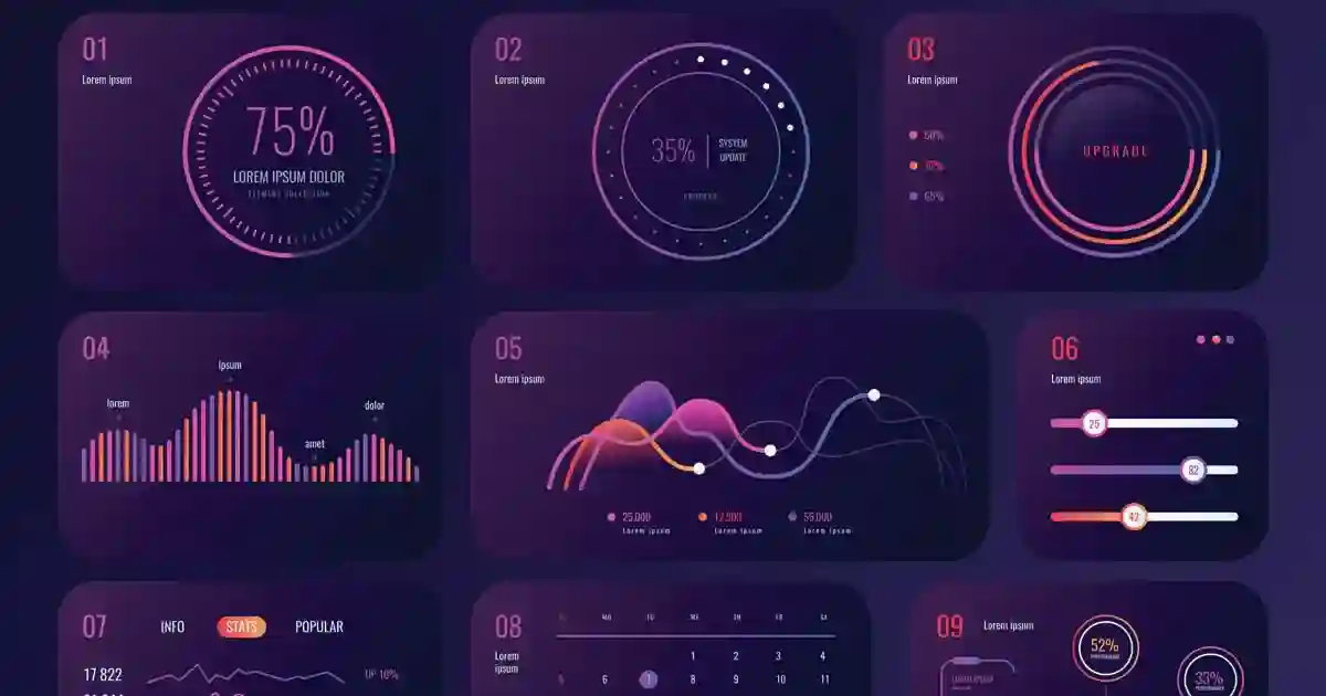
✅ CSS Transitions fundamentals ✅ Keyframe Animations and timing functions ✅ Transform properties and 3D effects ✅ Advanced animation techniques ✅ Performance optimization best practices ✅ Complete interactive dashboard project
In the next lesson we'll study CSS Grid Advanced Techniques and Complex Layouts.
Master CSS Animations and Transitions - keyframes, transforms, timing functions, and advanced animation effects for engaging web experiences.

Direct communication via WhatsApp or phone to understand your project needs precisely.
Creating clear work plan with specific timeline for each project phase.
Building projects with latest technologies ensuring high performance and security.
Comprehensive testing and thorough review before final project delivery.

If this topic is relevant to your current project, you can jump to one of the services above or browse the services page to choose the most suitable solution.


Get 20% off web development packages
Message now and get an instant quote
Start ranking better with a practical SEO roadmap