Special offer this week
Get 20% off web development packages
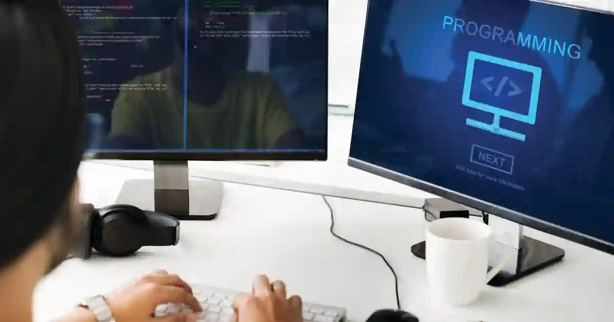
We offer a comprehensive collection of essential educational articles in web development to turn your ideas into digital reality
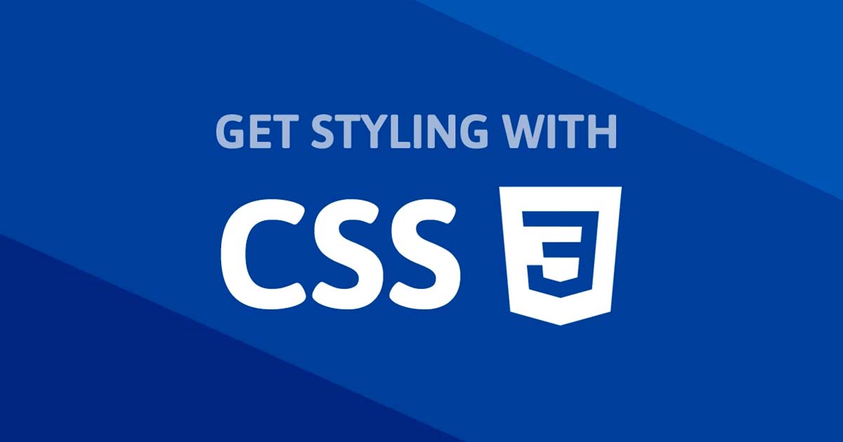
Responsive Design is the foundation of modern websites. Learn how to create sites that adapt seamlessly to all screen sizes and devices.
/* Basic Media Query structure */
@media screen and (max-width: 768px) {
  /* Code for screens smaller than 768px */
  .mobile-only {
    display: block;
  }
}

@media screen and (min-width: 769px) {
  /* Code for screens larger than 769px */
  .desktop-only {
    display: block;
  }
}

/* Media Query types */
@media screen {
  /* For screens only */
}

@media print {
  /* For print only */
}

@media screen and (orientation: portrait) {
  /* For portrait screens */
}

@media screen and (orientation: landscape) {
  /* For landscape screens */
}

/* Advanced Media Queries */
@media screen and (min-width: 768px) and (max-width: 1024px) {
  /* For tablets only */
}

@media screen and (min-resolution: 2dppx) {
  /* For high-resolution screens (Retina) */
}

@media (prefers-color-scheme: dark) {
  /* For users who prefer dark mode */
  body {
    background: #1a202c;
    color: white;
  }
}

@media (prefers-reduced-motion: reduce) {
  /* For users who prefer reduced motion */
  * {
    animation-duration: 0.01ms !important;
    animation-iteration-count: 1 !important;
    transition-duration: 0.01ms !important;
  }
}
/* Start with mobile then expand (preferred approach) */

/* Basic mobile code */
.card {
  width: 100%;
  padding: 15px;
  margin-bottom: 15px;
  background: white;
  border-radius: 8px;
  box-shadow: 0 2px 8px rgba(0, 0, 0, 0.1);
}

.card-title {
  font-size: 18px;
  margin-bottom: 10px;
  line-height: 1.3;
}

.card-content {
  font-size: 14px;
  line-height: 1.5;
  color: #666;
}

.button {
  width: 100%;
  padding: 12px;
  font-size: 16px;
  border: none;
  border-radius: 6px;
  background: #007bff;
  color: white;
  cursor: pointer;
  margin-top: 15px;
}

/* Tablet improvements */
@media screen and (min-width: 768px) {
  .card {
    width: calc(50% - 15px);
    display: inline-block;
    vertical-align: top;
    margin-right: 15px;
    padding: 20px;
  }

  .card:nth-child(2n) {
    margin-right: 0;
  }

  .card-title {
    font-size: 20px;
  }

  .button {
    width: auto;
    padding: 12px 24px;
    display: inline-block;
  }
}

/* Desktop improvements */
@media screen and (min-width: 1024px) {
  .card {
    width: calc(33.333% - 20px);
    margin-right: 20px;
    padding: 25px;
  }

  .card:nth-child(2n) {
    margin-right: 20px;
  }

  .card:nth-child(3n) {
    margin-right: 0;
  }

  .card-title {
    font-size: 22px;
    margin-bottom: 15px;
  }

  .card-content {
    font-size: 15px;
  }
}
/* Basic responsive images */
.responsive-image {
  max-width: 100%;
  height: auto;
  display: block;
}

/* Images with fixed aspect ratios */
.aspect-ratio-container {
  position: relative;
  width: 100%;
  padding-bottom: 56.25%; /* 16:9 ratio */
  overflow: hidden;
  border-radius: 12px;
}

.aspect-ratio-image {
  position: absolute;
  top: 0;
  left: 0;
  width: 100%;
  height: 100%;
  object-fit: cover;
  object-position: center;
}

/* Different images for different devices */
.device-specific-image {
  width: 100%;
  height: 200px;
  object-fit: cover;
  border-radius: 8px;
}

@media screen and (min-width: 768px) {
  .device-specific-image {
    height: 300px;
  }
}

@media screen and (min-width: 1024px) {
  .device-specific-image {
    height: 400px;
  }
}

/* Picture Element for responsive images */
/*
<picture>
  <source media="(min-width: 1024px)" srcset="image-large.jpg">
  <source media="(min-width: 768px)" srcset="image-medium.jpg">
  <img src="image-small.jpg" alt="Description" class="responsive-image">
</picture>
*/

/* Responsive backgrounds */
.responsive-background {
  background-image: url("mobile-bg.jpg");
  background-size: cover;
  background-position: center;
  min-height: 300px;
}

@media screen and (min-width: 768px) {
  .responsive-background {
    background-image: url("tablet-bg.jpg");
    min-height: 400px;
  }
}

@media screen and (min-width: 1024px) {
  .responsive-background {
    background-image: url("desktop-bg.jpg");
    min-height: 500px;
  }
}
This project demonstrates all responsive design concepts in a practical, complete company website.
<!DOCTYPE html>
<html lang="en">
<head>
<meta charset="UTF-8" />
<meta name="viewport" content="width=device-width, initial-scale=1.0" />
<title>Advanced Tech Company - Responsive Website</title>
<style>
/* Basic reset */
* {
margin: 0;
padding: 0;
box-sizing: border-box;
}
body {
font-family:
"Inter",
-apple-system,
BlinkMacSystemFont,
sans-serif;
line-height: 1.6;
color: #333;
background: #f8f9fa;
}
/* Flexible Container */
.container {
max-width: 1200px;
margin: 0 auto;
padding: 0 20px;
}
/* Responsive Header */
.header {
background: linear-gradient(135deg, #667eea 0%, #764ba2 100%);
color: white;
padding: 1rem 0;
position: sticky;
top: 0;
z-index: 100;
box-shadow: 0 2px 10px rgba(0, 0, 0, 0.1);
}
.header-content {
display: flex;
justify-content: space-between;
align-items: center;
}
.logo {
font-size: 1.5rem;
font-weight: bold;
}
.nav-links {
display: flex;
list-style: none;
gap: 2rem;
}
.nav-links a {
color: white;
text-decoration: none;
transition: opacity 0.3s ease;
}
.nav-links a:hover {
opacity: 0.8;
}
.mobile-menu-btn {
display: none;
background: none;
border: none;
color: white;
font-size: 1.5rem;
cursor: pointer;
}
/* Hero Section */
.hero {
background:
linear-gradient(rgba(0, 0, 0, 0.5), rgba(0, 0, 0, 0.5)),
url('data:image/svg+xml,<svg xmlns="http://www.w3.org/2000/svg" viewBox="0 0 1200 800"><rect fill="%23667eea" width="1200" height="800"/><rect fill="%23764ba2" opacity="0.8" width="1200" height="800"/></svg>');
background-size: cover;
background-position: center;
color: white;
text-align: center;
padding: 4rem 0;
}
.hero h1 {
font-size: 2.5rem;
margin-bottom: 1rem;
animation: fadeInUp 1s ease;
}
.hero p {
font-size: 1.2rem;
margin-bottom: 2rem;
animation: fadeInUp 1s ease 0.2s both;
}
.btn {
display: inline-block;
padding: 12px 30px;
background: #28a745;
color: white;
text-decoration: none;
border-radius: 25px;
transition: all 0.3s ease;
animation: fadeInUp 1s ease 0.4s both;
}
.btn:hover {
background: #218838;
transform: translateY(-2px);
box-shadow: 0 5px 15px rgba(40, 167, 69, 0.3);
}
/* Services Grid */
.services {
padding: 4rem 0;
background: white;
}
.section-title {
text-align: center;
font-size: 2rem;
margin-bottom: 3rem;
color: #333;
}
.services-grid {
display: grid;
grid-template-columns: repeat(auto-fit, minmax(300px, 1fr));
gap: 2rem;
margin-bottom: 2rem;
}
.service-card {
background: white;
padding: 2rem;
border-radius: 10px;
box-shadow: 0 5px 15px rgba(0, 0, 0, 0.1);
text-align: center;
transition: all 0.3s ease;
}
.service-card:hover {
transform: translateY(-10px);
box-shadow: 0 15px 30px rgba(0, 0, 0, 0.15);
}
.service-icon {
width: 60px;
height: 60px;
background: linear-gradient(135deg, #667eea, #764ba2);
border-radius: 50%;
display: flex;
align-items: center;
justify-content: center;
margin: 0 auto 1rem;
font-size: 1.5rem;
color: white;
}
.service-card h3 {
font-size: 1.3rem;
margin-bottom: 1rem;
color: #333;
}
.service-card p {
color: #666;
line-height: 1.6;
}
/* Footer */
.footer {
background: #333;
color: white;
text-align: center;
padding: 2rem 0;
}
.footer-content {
display: grid;
grid-template-columns: repeat(auto-fit, minmax(250px, 1fr));
gap: 2rem;
margin-bottom: 2rem;
}
.footer-section h4 {
margin-bottom: 1rem;
color: #667eea;
}
.footer-section p,
.footer-section a {
color: #ccc;
text-decoration: none;
line-height: 1.8;
}
.footer-section a:hover {
color: white;
}
/* Animations */
@keyframes fadeInUp {
from {
opacity: 0;
transform: translateY(30px);
}
to {
opacity: 1;
transform: translateY(0);
}
}
/* Mobile Styles */
@media screen and (max-width: 768px) {
.container {
padding: 0 15px;
}
.header-content {
flex-wrap: wrap;
}
.nav-links {
display: none;
position: absolute;
top: 100%;
left: 0;
right: 0;
background: rgba(102, 126, 234, 0.95);
flex-direction: column;
padding: 1rem;
gap: 1rem;
text-align: center;
}
.nav-links.active {
display: flex;
}
.mobile-menu-btn {
display: block;
}
.hero {
padding: 2rem 0;
}
.hero h1 {
font-size: 1.8rem;
}
.hero p {
font-size: 1rem;
}
.services {
padding: 2rem 0;
}
.section-title {
font-size: 1.5rem;
margin-bottom: 2rem;
}
.services-grid {
grid-template-columns: 1fr;
gap: 1.5rem;
}
.service-card {
padding: 1.5rem;
}
.footer-content {
grid-template-columns: 1fr;
gap: 1.5rem;
text-align: left;
}
}
/* Tablet Styles */
@media screen and (min-width: 769px) and (max-width: 1024px) {
.hero h1 {
font-size: 2.2rem;
}
.services-grid {
grid-template-columns: repeat(2, 1fr);
}
}
/* Large Desktop */
@media screen and (min-width: 1200px) {
.container {
padding: 0 40px;
}
.hero {
padding: 5rem 0;
}
.hero h1 {
font-size: 3rem;
}
.services {
padding: 5rem 0;
}
.services-grid {
grid-template-columns: repeat(3, 1fr);
}
}
/* Print Styles */
@media print {
.header,
.footer,
.btn {
display: none;
}
body {
background: white;
color: black;
}
.hero {
background: none;
color: black;
}
}
/* Dark Mode Support */
@media (prefers-color-scheme: dark) {
body {
background: #1a1a1a;
color: #e0e0e0;
}
.services {
background: #2d2d2d;
}
.service-card {
background: #3a3a3a;
color: #e0e0e0;
}
.section-title {
color: #e0e0e0;
}
}
/* Reduced Motion */
@media (prefers-reduced-motion: reduce) {
*,
*::before,
*::after {
animation-duration: 0.01ms !important;
animation-iteration-count: 1 !important;
transition-duration: 0.01ms !important;
}
}
</style>
</head>
<body>
<!-- Header -->
<header class="header">
<div class="container">
<div class="header-content">
<div class="logo">Tech Company</div>
<nav>
<ul class="nav-links" id="navLinks">
<li><a href="#home">Home</a></li>
<li><a href="#services">Services</a></li>
<li><a href="#about">About</a></li>
<li><a href="#contact">Contact</a></li>
</ul>
<button class="mobile-menu-btn" id="mobileMenuBtn">☰</button>
</nav>
</div>
</div>
</header>
<!-- Hero Section -->
<section class="hero" id="home">
<div class="container">
<h1>We Build the Digital Future</h1>
<p>Advanced and innovative technical solutions for all your needs</p>
<a href="#services" class="btn">Discover Our Services</a>
</div>
</section>
<!-- Services Section -->
<section class="services" id="services">
<div class="container">
<h2 class="section-title">Our Distinguished Services</h2>
<div class="services-grid">
<div class="service-card">
<div class="service-icon">🖥️</div>
<h3>Web Development</h3>
<p>
We design and develop responsive and fast websites using the
latest technologies
</p>
</div>
<div class="service-card">
<div class="service-icon">📱</div>
<h3>Mobile Apps</h3>
<p>
Advanced mobile applications that work efficiently on all systems
</p>
</div>
<div class="service-card">
<div class="service-icon">🎨</div>
<h3>Graphic Design</h3>
<p>
Creative designs and distinctive visual identity for your brand
</p>
</div>
<div class="service-card">
<div class="service-icon">🚀</div>
<h3>Digital Marketing</h3>
<p>
Effective digital marketing strategies for your business growth
</p>
</div>
<div class="service-card">
<div class="service-icon">☁️</div>
<h3>Cloud Computing</h3>
<p>Secure and scalable cloud solutions for data management</p>
</div>
<div class="service-card">
<div class="service-icon">🔒</div>
<h3>Cybersecurity</h3>
<p>
Comprehensive protection for your systems and data from cyber
threats
</p>
</div>
</div>
</div>
</section>
<!-- Footer -->
<footer class="footer">
<div class="container">
<div class="footer-content">
<div class="footer-section">
<h4>Contact Us</h4>
<p>📧 [email protected]</p>
<p>📞 +1 234 567 8900</p>
<p>📍 New York, United States</p>
</div>
<div class="footer-section">
<h4>Our Services</h4>
<a href="#services">Web Development</a><br />
<a href="#services">Mobile Apps</a><br />
<a href="#services">Graphic Design</a><br />
<a href="#services">Digital Marketing</a>
</div>
<div class="footer-section">
<h4>Important Links</h4>
<a href="#about">About Us</a><br />
<a href="#services">Our Services</a><br />
<a href="#contact">Contact Us</a><br />
<a href="#privacy">Privacy Policy</a>
</div>
</div>
<p>© 2024 Advanced Tech Company. All rights reserved.</p>
</div>
</footer>
<script>
// Mobile menu toggle
const mobileMenuBtn = document.getElementById("mobileMenuBtn");
const navLinks = document.getElementById("navLinks");
mobileMenuBtn.addEventListener("click", () => {
navLinks.classList.toggle("active");
});
// Smooth scrolling for anchor links
document.querySelectorAll('a[href^="#"]').forEach((anchor) => {
anchor.addEventListener("click", function (e) {
e.preventDefault();
const target = document.querySelector(this.getAttribute("href"));
if (target) {
target.scrollIntoView({
behavior: "smooth",
block: "start",
});
}
});
});
// Close mobile menu when clicking on a link
navLinks.addEventListener("click", (e) => {
if (e.target.tagName === "A") {
navLinks.classList.remove("active");
}
});
// Add scroll effect to header
window.addEventListener("scroll", () => {
const header = document.querySelector(".header");
if (window.scrollY > 100) {
header.style.background = "rgba(102, 126, 234, 0.95)";
header.style.backdropFilter = "blur(10px)";
} else {
header.style.background =
"linear-gradient(135deg, #667eea 0%, #764ba2 100%)";
header.style.backdropFilter = "none";
}
});
</script>
</body>
</html>
In this lesson we learned:
✅ Responsive design fundamentals ✅ Advanced Media Queries ✅ Comprehensive Breakpoints system ✅ Mobile First vs Desktop First ✅ Responsive images and typography ✅ Complete responsive company project
In the next lesson we'll study CSS Animations and motion effects.
Master Responsive Design in CSS - Media Queries, Breakpoints, Mobile First, Desktop First, and latest responsive design techniques.

Direct communication via WhatsApp or phone to understand your project needs precisely.
Creating clear work plan with specific timeline for each project phase.
Building projects with latest technologies ensuring high performance and security.
Comprehensive testing and thorough review before final project delivery.
If this topic is relevant to your current project, you can jump to one of the services above or browse the services page to choose the most suitable solution.


Get 20% off web development packages
Message now and get an instant quote
Start ranking better with a practical SEO roadmap